Bergen Bakery
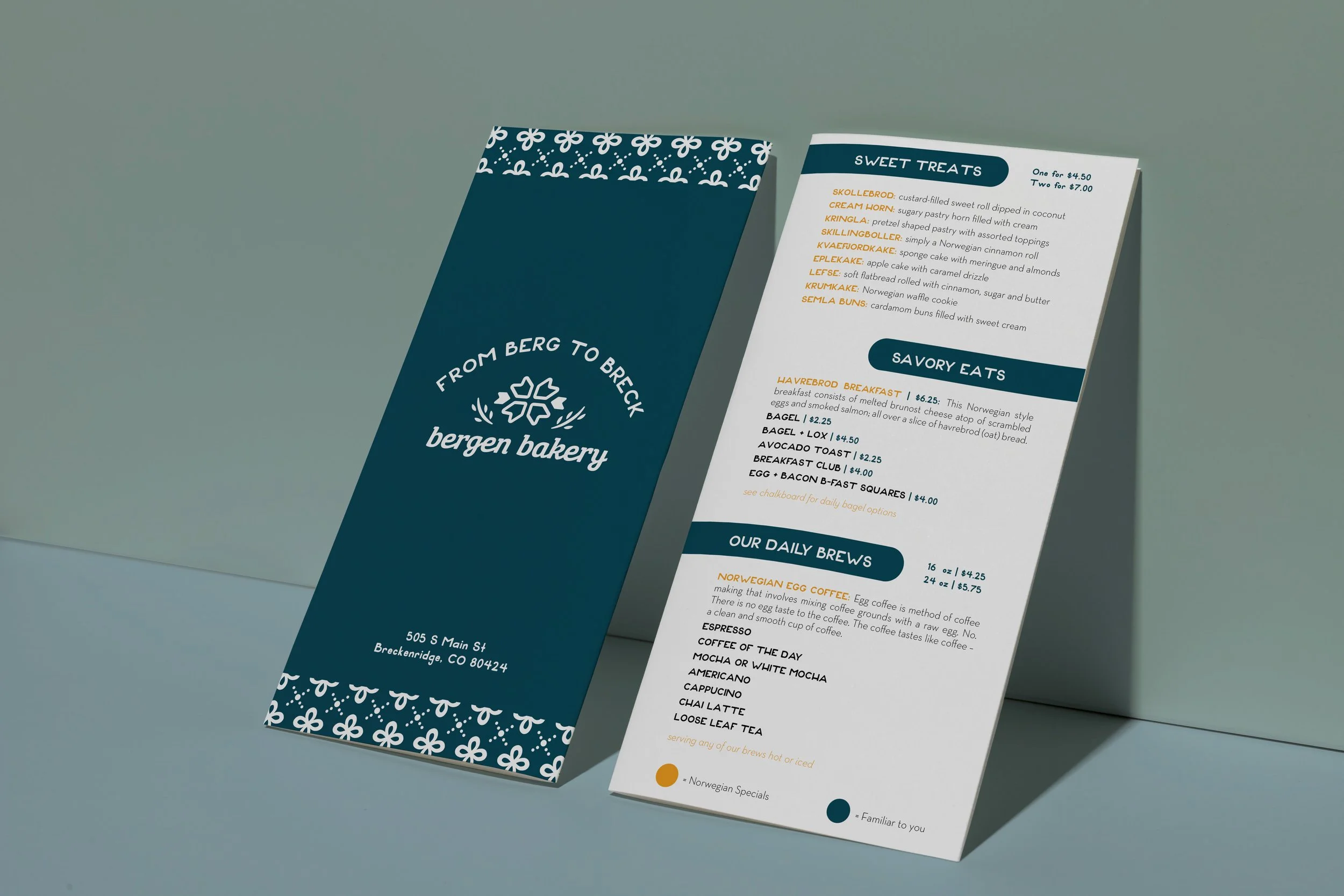
Bergen Bakery is a small bakeshop located in downtown Breckenridge, CO. This bakery is influenced by a very specific type of culinary culture. Not too many bakeries use Norwegian delicacies to base their recipes off of.
Brand Identity

Tranquil
Wholesome
Charming
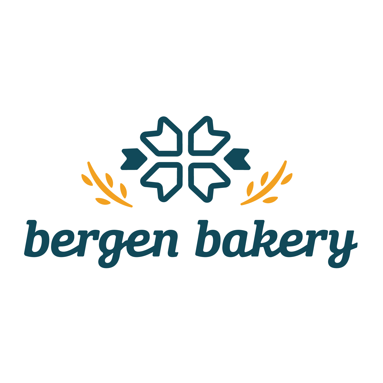
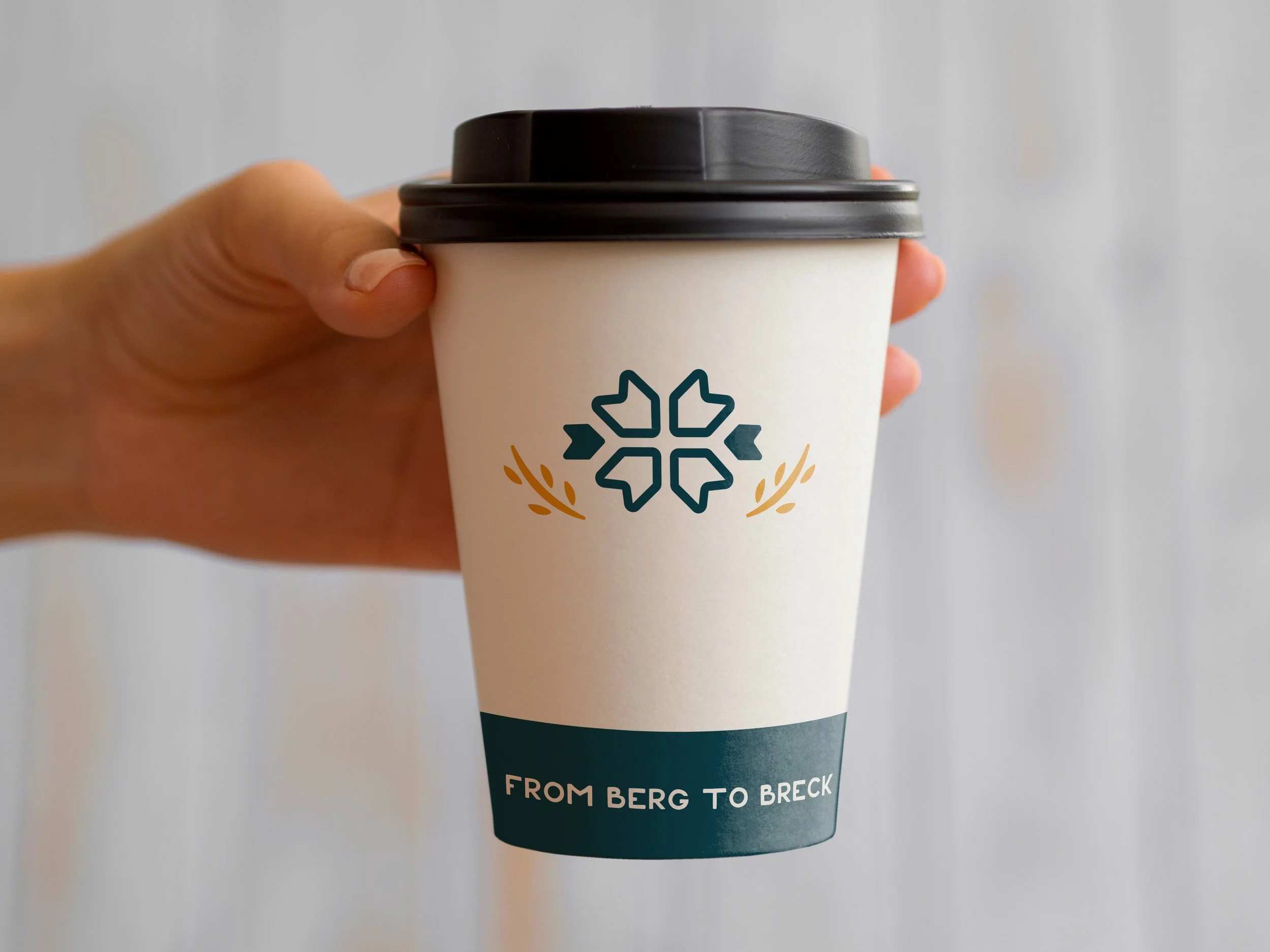
This logo features geometrical elements that tie into Norwegian-style print. The emblem located in the center is called a selburose, which is commonly used in Norwegian culture. The two organic shapes off to the side of the emblem represent stocks of wheat in relation to baking. And an organic, heavy script typeface is seen below to create charm and character to the logo.
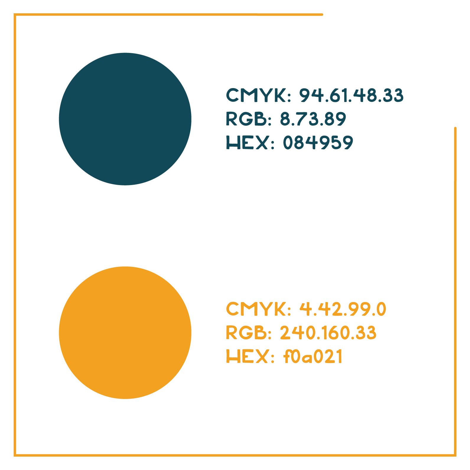
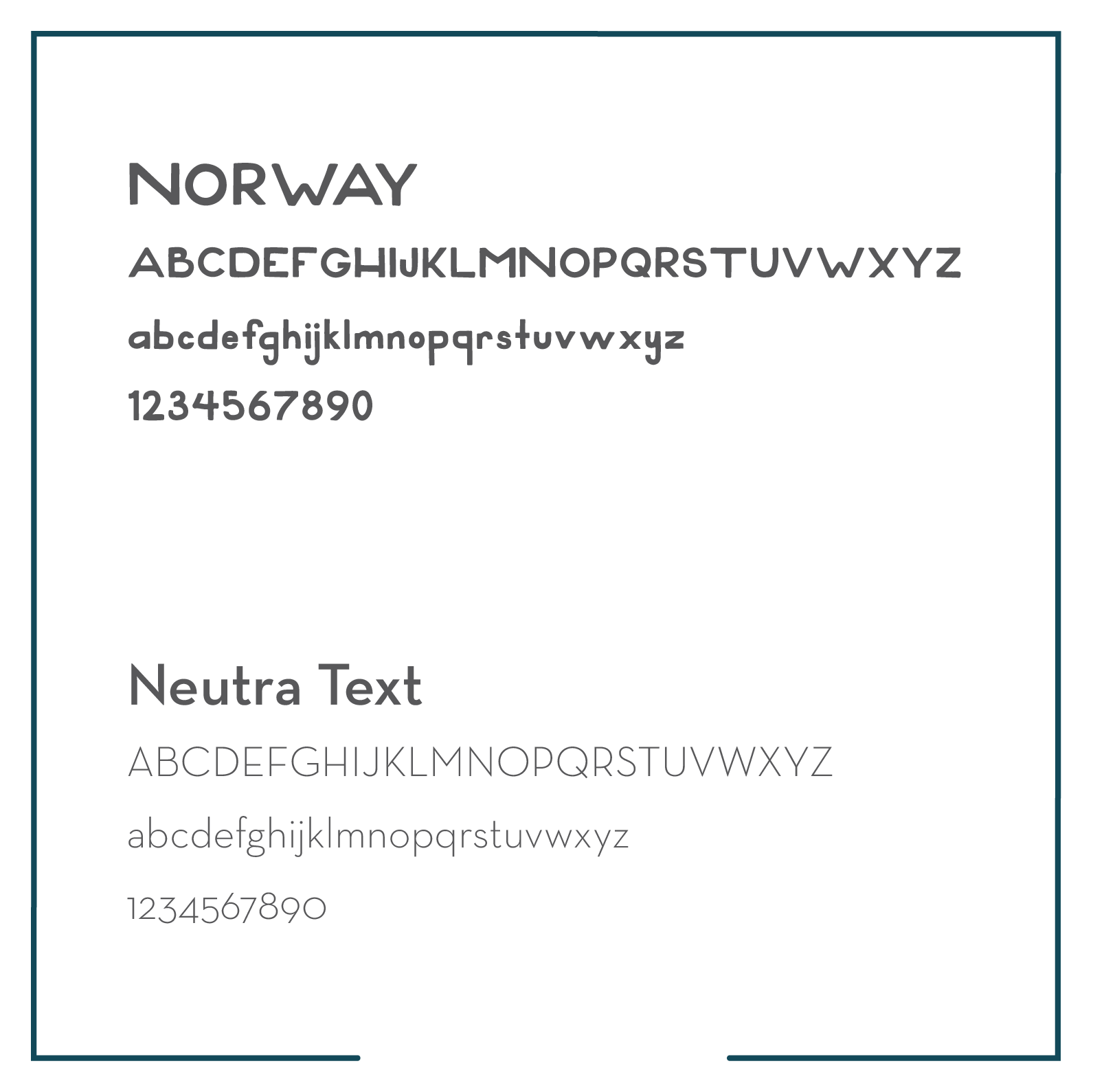
The deep blue-green color is meant to represent the Breckenridge atmosphere and the golden yellow represents the city-scape of Bergen, Norway. The typeface Norway is a bold-chunky san-serif that has an outdoor feel to it. This pairs well with the dainty aspects of Neutra Text.
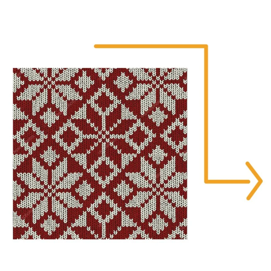
This is the selburose print that inspired the patterning in the menu, business cards, and logo design.


