The Lakelander
Magazine Layout Design
The Lakelander magazine is a monthly publication that is introduced to the public by Lakelander Media. These are layout examples of some issues that I have contributed to under the guidance of the creative director. It begins with conceptualizing each feature, then flows into making each page come to life; all while maintaining the integrity of the article pertaining to the feature.
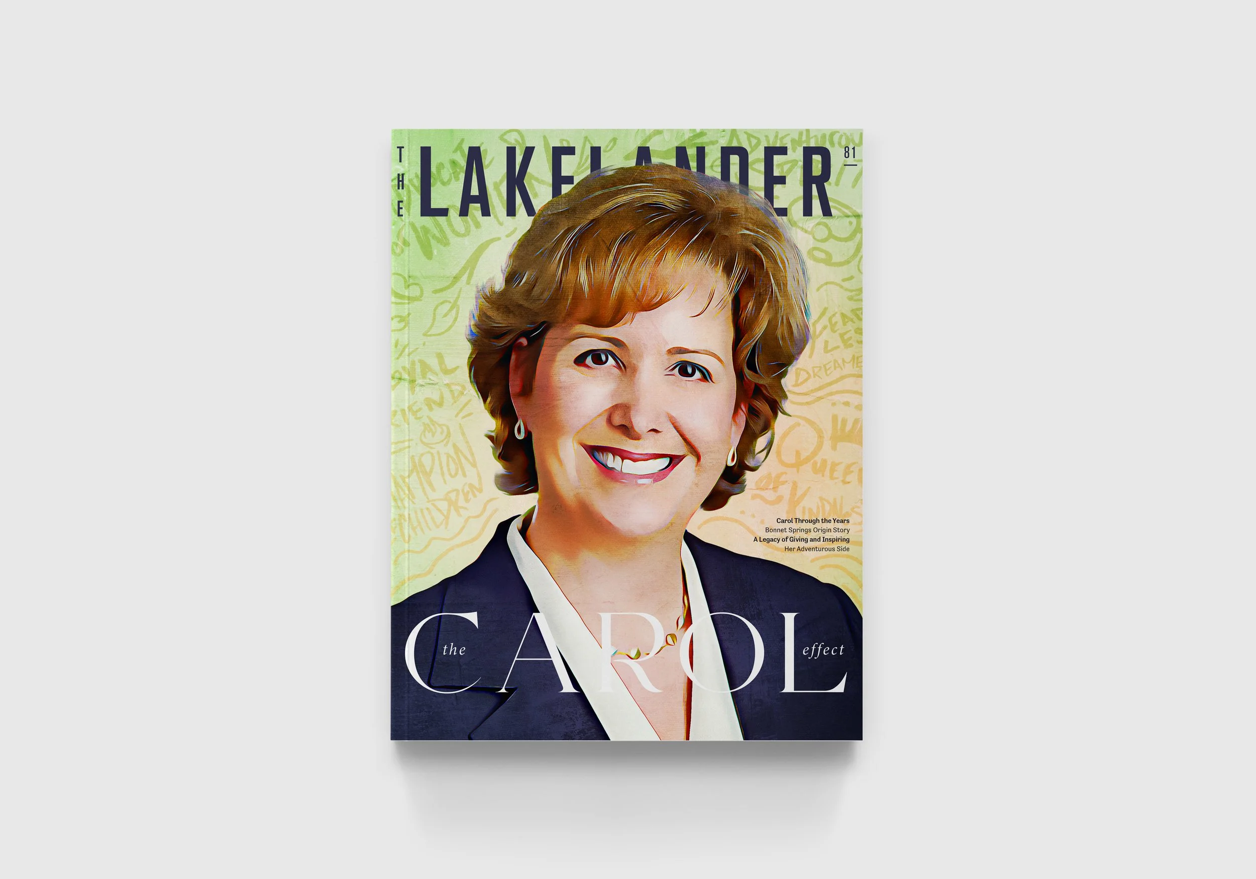
Issue 81: The Carol Effect
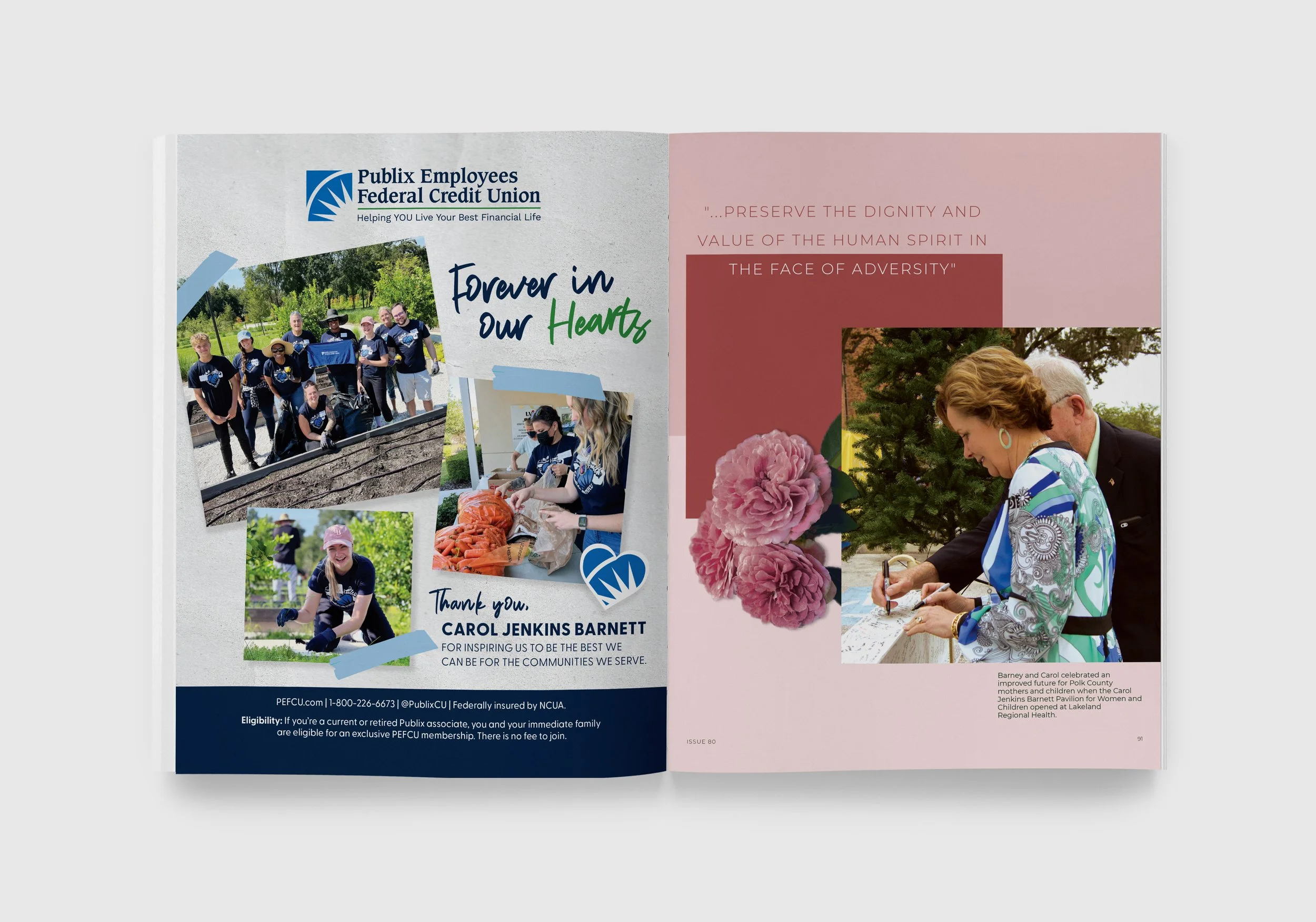
This was the first issue that I had the opportunity to contribute in The Lakelander. The entire issue is dedicated to a Lakeland icon, Carol Jenkins Barnett. The feature displayed below discusses how Carols philanthropy work shaped the community, so soft color tones and imagery of flowers were used to demonstrate her kindness. A feminine typeface was chosen to match her welcoming persona and the staggered images keep the reader engaged while maintaining a directional flow.
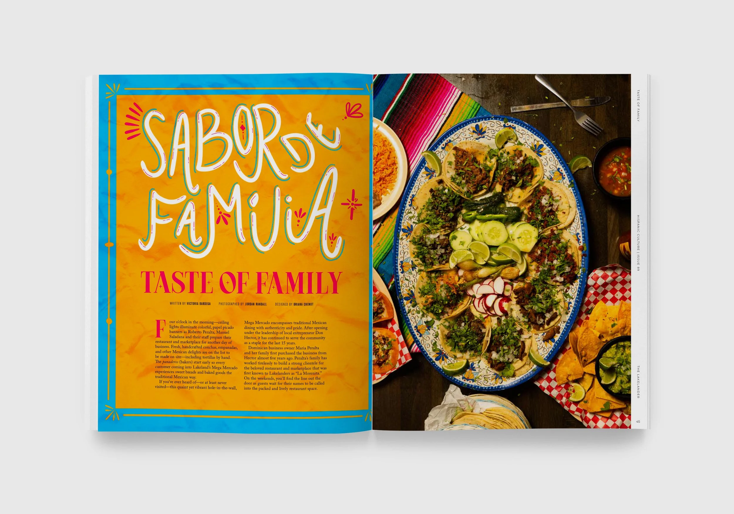
Issue 89: Hispanic Culture
In this issue, it was important to show the exciting and festive aspects of hispanic culture. The vibrant colors jump off of the page to entertain the reader while emulating the celebratory characteristics of the many different hispanic cultures. This is also displayed through the hand-drawn illustrations and elements throughout the feature.
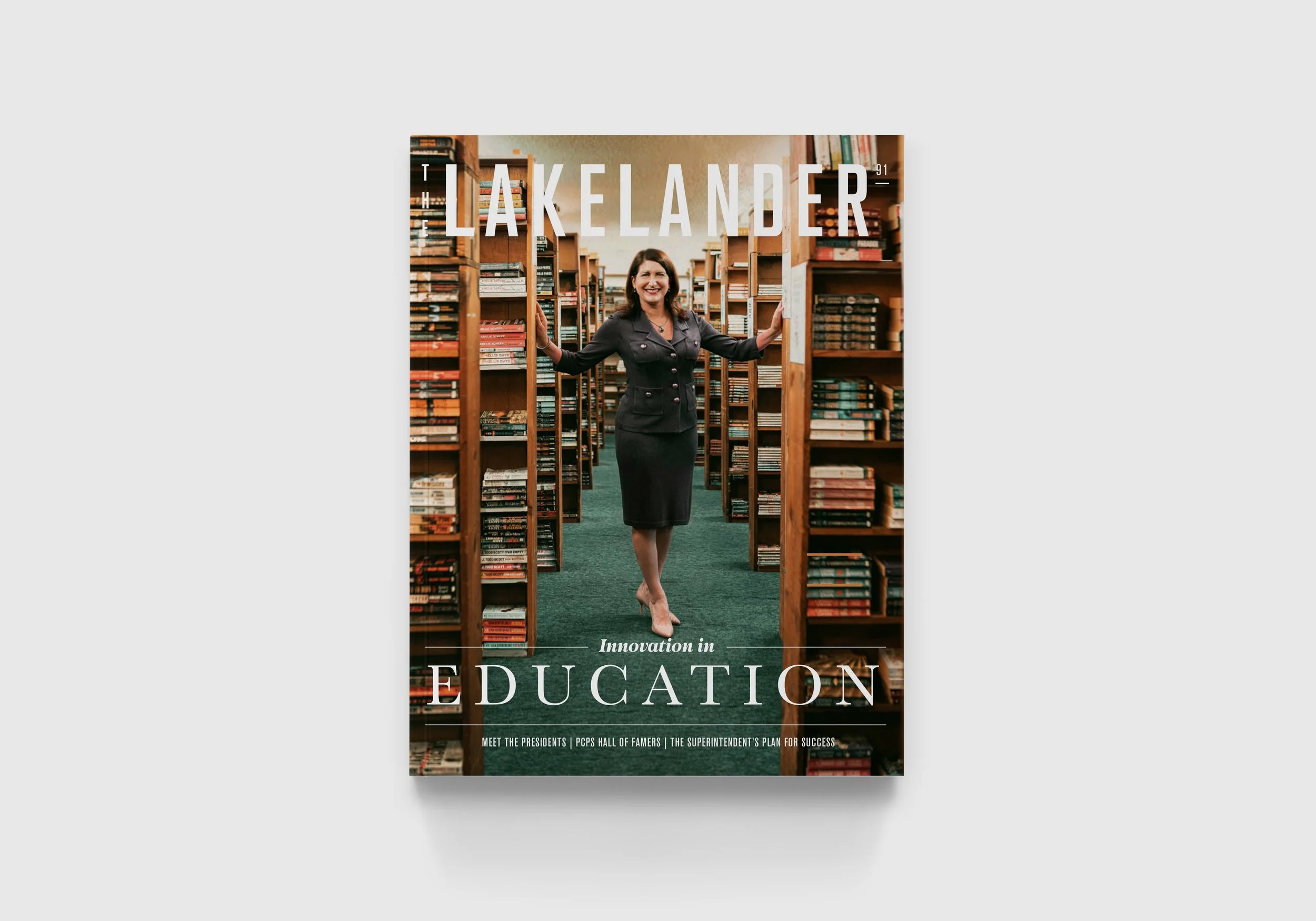
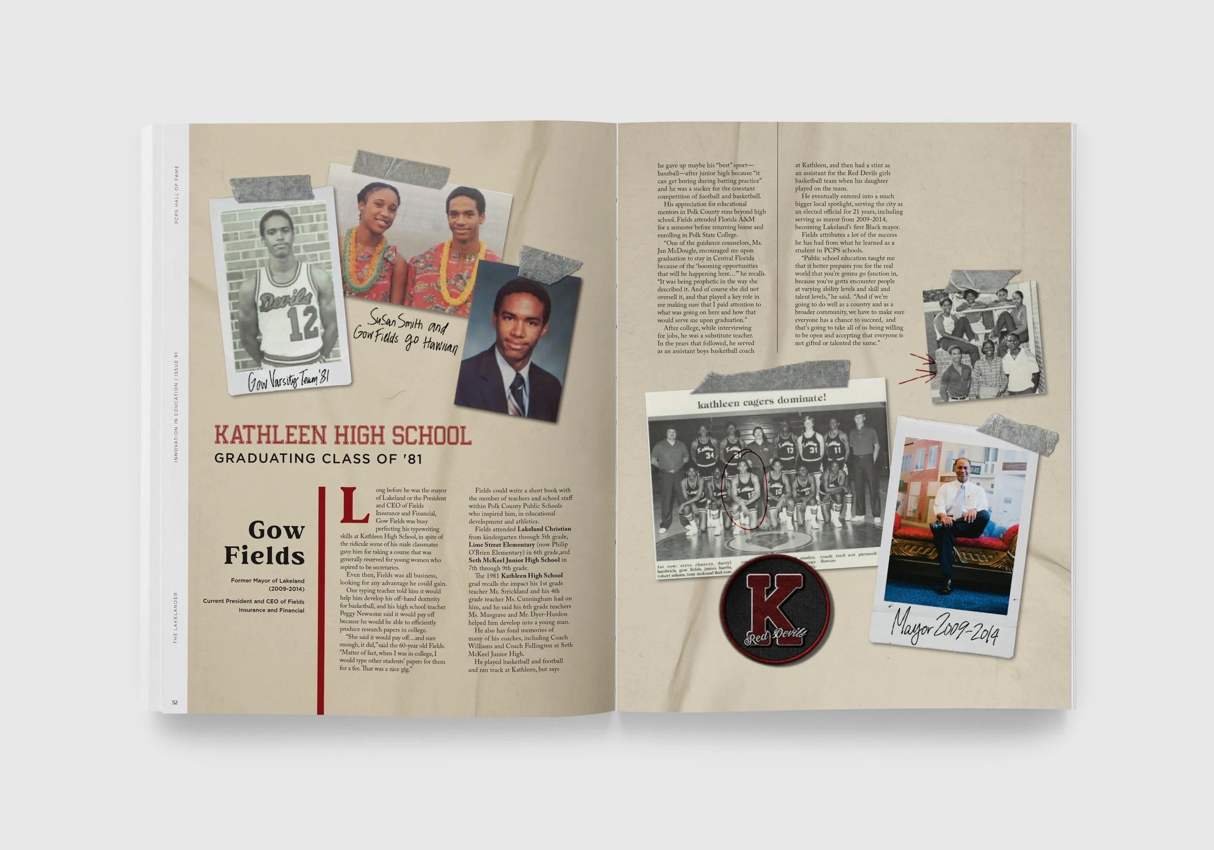
Issue 91: Innovation in Education
The aim for issue 91 was to use nostalgia in order to relate to the target demographic. I thoroughly enjoy this style as it is heavily inspired by old-fashioned yearbooks. The touches of hand-written elements and peeling tape makes this feel personal to the reader.
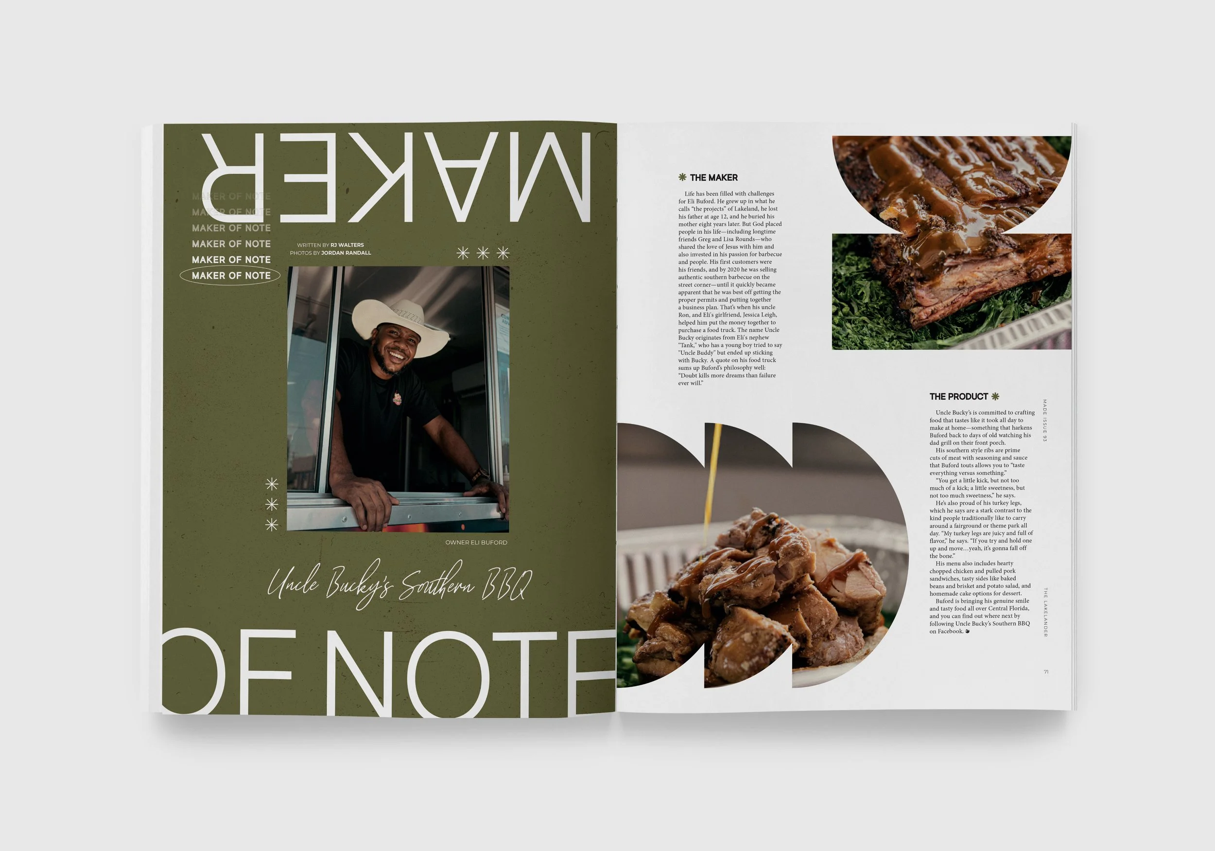
Issue 93: Made
The design style used in this issue has developed into one of my favorites. Inspired by brutalism style, it uses minimal treatments in typography and elements to create this almost nostalgic feeling which I deem as “modern nostalgia.” This treatment takes even more attention to detail, as it is important that the placement of each element is recognized as purposeful rather than accidental.
Final Takeaways
It is important to note that although I did not design the covers (the creative director did a great job on those,) I did contribute through opinions on color, font choices, and which imagery was the best fit. The layouts displayed above are just a few of the many that I enjoyed designing for The Lakelander. It is exciting to see each feature take shape and come to life so that each story can shine.
